All play & no work makes Jack a skint boy.
I've been busy this week working on non-related college work. I seem to have a surge of people wanting design and print work doing quickly.
I have 2 websites, 3 flyers with 5000 print run off each and some birthday invites.
Although my design style has not changed that much since starting college I have a clearer outlook on what is expected and the ability to plan and manage time more efficiently.
So as and when I do these jobs I will post them on here to hopefully gain some constructive comments.
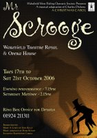
Heres a brochure I did a few weeks ago. The Society did not have any stock pictures or any photographs of the principle players. After a few designs I decided to hand draw a picture of Scrooge which was terrible to begin with so I then made it a silhouette. I then created a shadow in Photoshop then using the filters and lighting effects created a background that gave it a 'Mona Lisa' old feel to it.
By the way, always get the client to check and double check your work then you have no responsibility for any errors. The 3500 leaflets that went out had Tues 16th October printed on them (which was in my brief) when in actual fact the Tuesday was the 17th. It had been checked by 4 members of the society.

This flyer is to promote the Day Care Centre at Kinsley, it is a new unfinished building but they wanted to advertise before it is fully completed. They have a corporate colour, so the design had to incorporate the blue and the various logos. A few pictures set the scene well and it hopefully looks like a fully functioning Centre.
 Will post the others when I complete them. Comments and criticism greatly appreciated to help me in my quest.

4 Comments:
Love the scrooge design Dean, espeically the way the shadow of the character is in the background. The text is unusual too on the dates and time of the performance
Great designs designs Dean, you've done well with the scrooge image i like the shadow effect and the dim light to show it almost like a lanton or something. Nice n bright day care flyer too, i think that the bullets would look better if all the text fit on the same line if possible but excellant, very impressive
Mr Scrooge has a very dark and sinister atmosphere you seem to have captured the victorian age well, I hope it doesn't scare the kids away!
The day care centre seems like a harder brief to tackle I'm not sure who it is aimed at, Care workers? or the actual people with difficulties? I agree with Jamie about the bullet points. Also I have to side with Steve when it comes to centred text, maybe try aligning the address to the right? Would this fit into our repetition layout criteria? I don't know!
Thanks guys for your comments, keep them coming as it learns me for next time. Scott, the flyer is aimed at the parents of the trainees.
Surprised I haven't had a comment from Mr Burgess, is he okay?
Post a Comment
<< Home