The Thin Blue Line
What a difference a fortnight makes.
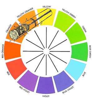
Last week and the week before I was feeling pretty miserable but I have to say that this Wednesday at college was my most enjoyable so far. After a short lecture on Sir Isaac Newtons colour wheel we were left to get on with our assignment(s).
This was a chance to really crack on and compared to my home study was a big advantage in the fact that I could confer with my peers as I researched and drafted my goals, target audience and delivery requirements. Any queries that arose as I studied help was within arms reach. This, along with me now being rid of my virus made a refreshing change. I have to say, (but don't quote me) I think the extra hour at the end of the day helped tremendously too.
Even though on paper it seemed like I had not done much, I had made loads of notes in my sketch book and amended them 2 and 3 times so that they were accurate when it comes to typing up my assignment which I am leaving till the latter end this time round.
A talk with Diane was also very helpful . Contrary to what people thought, the whole conversation was connected to my current assignment. I also found out things about previous courses and how things have evolved into the course we are currently studying.
A fun day too having a laugh now and again added to the enjoyment while still being able to work in the classroom environment without resorting to my nomadic lifestyle in the quiet study area of the library.
On another note my latest completed website can be found here www.goldringphotography.co.uk and before you all start commenting on splash screens, tables and lack of CSS, this is what the client wanted and all I was able to achieve in the tight deadline AND budget that I was given. I am pleased with the design and the blue is his corporate identity colour.
The glistening logo at the top of the navigation bar was solely my own idea. I have no experience with Flash other than a couple of moving logos that I have created in the past. This particular one is just 2 jpg files, one with starburst and one without. The starburst is laid over the top and and the opacity changes throughout a 10 second cycle giving the feeling of random movement. This is set to repeat in Dreamweaver and looks quite effective.
The galleries were created in less than 30 seconds using the 'Web Gallery' feature of Photoshop CS. There are about 20 others to choose from if a bit limited in their flexibility but they are easy to use and time saving. I showed this 'hidden' feature to Diane who was impressed by its simplicity.
Give it a go fellow peers with a few images in a folder and let me know if you like it.
On a lighter note I have learned that the college is to draw a blue line around a designated smoking area outside which us smokers have to stay within the boundaries when puffng at breaktime.
Situated in the Creative Media section of the college, it will apparently be 72pts thick, pantone 2718C in colour and have its own website. Analogous colours used in the design of the website will be taken from Sir Isaac Newtons' NICOTINE section of his famous colour wheel.


5 Comments:
We can't comment on splash screens, tables or lack of CSS - where's the fun in that!?
Any reason why the home button isn't at the top of the menu - or the logo isn't the home button? It might look visually better to match alignments for the menu and the address - even if they're both centred.
It's awkward working for clients who have a fixed view of how things should be. If possible we have a duty of 'try' and educate them. If they still won't listen ... take the money and run!
I could say the same to you.
The nicotine section of the colour wheel is one of my favourites.
feel free to drop my name when talking about the really helpful people that sit near you in class, I don't mind.
Hi Dean, I think you are doing the right thing by writing down ideas in your sketchbook and amending them before you type your work up. I sometimes do this because if you just went straight to typing things up you may miss some important ideas, it also looks good as part of our Sketchbook assignment!
Dean I think you should post one of your original target audience descriptions, let people know how deeply you thought about them! Maybe we could use it as a template for future target audiences!
Great blog I like how you use a lot of images within it. It helps break it up and makes it readable.
I agree, a really Interesting blog, I always make sure I visit your's when scanning through. Good to see that you've completed more work too, is it on to the next Project now? I'll look forwards to seeing it. Similar technique to me also when it comes to written work and using the Sketch Book first.
Post a Comment
<< Home