Thursday, November 30, 2006

My favourite type of 'ography'

A tasty little subject was the topic of the morning and one that I was interested to find out more about.

Different types of fonts, font families, leading, etc. might seem like a boring subject for some people but to a designer the type of font used is absolutely crucial to the look and feel of a design and the way body text is read.
I knew about Serif and Sans Serif fonts but never actually knew the difference.

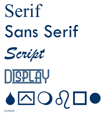
I also did not know that there was another font type called Display which has to be used very carefully as too much use can result in an explosion of tackiness and illegibility. Just take a walk down Westgate in Wakefield to see some examples.

Wondering where 'font' came from and my thirst for useless/useful trivia (delete where applicable) prompted me to find out from www.reference.com.
"The term font derives from Middle French fonte, meaning "(something that has been) melt(ed)", referring to type produced by casting molten metal at a type foundry. English-speaking printers have used the term fount for centuries to refer to the multi-part metal type used to assemble and print in a particular size and typeface."
It will be interesting to see who takes note on this short but important subject when incorporating it into their latest assignment, or any future assignments for that matter.
Our target audience for whom we are creating this website for is aimed at relative beginners and novices so the typography used on the screen designs should reflect this.

Alternatively if designing for a babies Christening then this font should be used.


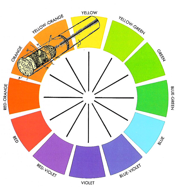
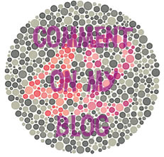
A good days work was achieved afterwards which came as a bit of a blessing as I still had one content subject left to research which was 'software'. Limited slightly by the 'WWW access denied' syndrome from the college computers I did some research into colour. Being colour blind, as are 8% of the male population, I find colour very important when creating any kind of design, particlarly with Red and Green.

Much to Marc's amusement he proceeded to test me using colour blindness test charts amazed that I could not see the numbers embedded within. After being diagnosed with this problem at an early age I was told I could never become a train driver or a firemen. So with this 'disability' I became a Photographic Colour Printer for 11 years.

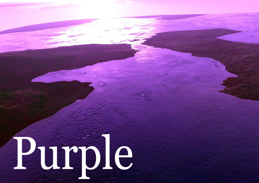
If anybody has actually read the descriptions for the sections in our Colour Index book you will see that combinations of certain colours convey different messages depending on how they are used. Yellow suggests positive energy and growth where as natural colours express an earthy no-nonsense approach.

Like fonts, colours play a big part in the image you are trying to portray.

Take the test yourself and check your colour vision and let me know if you are spectrumly challenged like me.
Or try this one and see if you can see the hidden message and act upon it:

Thursday, November 23, 2006

A James Dean Production

Well what a day at the House of Thornes. Talk about being thrown in at the deep end.

"Research a colour for it's cultural and psycological significance, prepare and deliver a 2-3 minute presentation about your findings using speech, slides and a A4 flyer handout. Have it ready by 2.00pm". The looks on everyones face were priceless. Feelings of dread and of excitement were flying around the room at a rate of knots.

The colour I was given was PURPLE. James also had the same colour so we got together and worked as a team to try and come up with something worthy. This is the first time I had worked with James and I enjoyed his input tremendously, he not only has good ideas but he can also take on board other peoples opinions with ease.

We had a good method, if a tad unplanned initially. We would both come up with as many ideas as possible, write them in our sketchbook then split the tasks so that I would find pictures for the slideshow and sort the order of the presentation in cue card form and James would design the flyer and the slides. We then had the difficulty of trying to find somewhere to practice and rehearse. The library being the usual option was far too quiet to be using expressionistic dialogue so at the other end of the scale we settled in the refectory.

After major adjustments to the order of the presentation we each went through it. I was surprised to find out that James was a natural in this kind of thing and his so called 'blagging through it' was actually 'expert improvisation' and would have put some professionals to shame. I felt that we both had a very good little show and was confident that it would go down well.

James went up first, which turned out to be a good thing as I could use his feedback to input into my talk. Over running was James' only problem which I bared in mind.

I went to give my presentation and was surprised by how nervous I was as I do worse than this every week. I tried to talk clearly and use my hands for expression. Nerves do make you forget a couple of things and in this case it was a bit of shuffling and not moving on my second slide. During my talk, I looked up at the slides and I realised how professional they looked on the screen which nearly distracted me from the job in hand.

I feel that in the timescale given we did extremely well and were pleased with our 'performances'. I think nerves played a small part in my delivery but this is only a natural at this stage in the course.

Also well done to James as his input gave it an edge that I could not have done in such a short time.

An interesting talk with Steve about the blogs made me realise the importance of 'the email' he sent out and also that the comments we leave should be more constructive using criticism with equal amounts of praise. Comments I leave in the future will be constructive and concise, in theory.

I feel the afternoon was a bit wasted as we had to wait in the refectory that has a distinct lack of research material unless you are on a Domestic Cleaning Services Course learning about 'large women in large smocks with large mops and wrinkly socks' (Dr Seuss, 1982).

Thursday, November 16, 2006

The Thin Blue Line

What a difference a fortnight makes.
Last week and the week before I was feeling pretty miserable but I have to say that this Wednesday at college was my most enjoyable so far. After a short lecture on Sir Isaac Newtons colour wheel we were left to get on with our assignment(s).

This was a chance to really crack on and compared to my home study was a big advantage in the fact that I could confer with my peers as I researched and drafted my goals, target audience and delivery requirements. Any queries that arose as I studied help was within arms reach. This, along with me now being rid of my virus made a refreshing change. I have to say, (but don't quote me) I think the extra hour at the end of the day helped tremendously too.

Even though on paper it seemed like I had not done much, I had made loads of notes in my sketch book and amended them 2 and 3 times so that they were accurate when it comes to typing up my assignment which I am leaving till the latter end this time round.

A talk with Diane was also very helpful . Contrary to what people thought, the whole conversation was connected to my current assignment. I also found out things about previous courses and how things have evolved into the course we are currently studying.

A fun day too having a laugh now and again added to the enjoyment while still being able to work in the classroom environment without resorting to my nomadic lifestyle in the quiet study area of the library.

On another note my latest completed website can be found here www.goldringphotography.co.uk and before you all start commenting on splash screens, tables and lack of CSS, this is what the client wanted and all I was able to achieve in the tight deadline AND budget that I was given. I am pleased with the design and the blue is his corporate identity colour.

The glistening logo at the top of the navigation bar was solely my own idea. I have no experience with Flash other than a couple of moving logos that I have created in the past. This particular one is just 2 jpg files, one with starburst and one without. The starburst is laid over the top and and the opacity changes throughout a 10 second cycle giving the feeling of random movement. This is set to repeat in Dreamweaver and looks quite effective.

The galleries were created in less than 30 seconds using the 'Web Gallery' feature of Photoshop CS. There are about 20 others to choose from if a bit limited in their flexibility but they are easy to use and time saving. I showed this 'hidden' feature to Diane who was impressed by its simplicity.

Give it a go fellow peers with a few images in a folder and let me know if you like it.

On a lighter note I have learned that the college is to draw a blue line around a designated smoking area outside which us smokers have to stay within the boundaries when puffng at breaktime.

Situated in the Creative Media section of the college, it will apparently be 72pts thick, pantone 2718C in colour and have its own website. Analogous colours used in the design of the website will be taken from Sir Isaac Newtons' NICOTINE section of his famous colour wheel.

Friday, November 10, 2006

Against CAPITAL Punishment

The week has taken a while to get kick started. I have struggled to make the new assignment different from the last one in the fact my goals are all measurable. The rest of the assignment will be enjoyable finding out about the different components and software relating to PC’s.

I do find I have to plan what I can get done at college and what I can get done at home. This is mainly due to the fact you cannot access all websites from college as many are blocked.

The talk on creating a business card was one of the most interesting so far and the reason for me being on this course. This was also interesting to see other people’s thoughts on how a design should look. I was quite pleased with my design as it had at least 2 out of the 4 requirements, Proximity, Alignment, Repetition and Contrast. My use of capital letters on the company name was my main downfall. The reason for me doing this was to bring back importance to the company name as I had put it on the bottom to try and make it different from others.

I’m not sure who wrote ‘not in order’ on my design but the brief said ‘order of importance’ which is quite different to sequential order.

Wrong

Right?

I have also found out this week that the libraries are finding it difficult to keep up with the computer sections. Lots of books explaining how the fast processors of today like a 486DX??? can handle applications running Windows 98 with fast modem speeds of 56k.

I think a visit to WHSmith with my sketchpad might be more useful.

My peers (I do hate that word, they’re classmates) seem to be really cracking on with the assignment in a big way. This is mainly due to the fact that they have 2 assignments rather than just the one that Drew and I have. I must say though the Picture This assignment looks right up my street.

Living at home with two children makes the college classroom seem really quiet and peaceful, however I have found solace in the quiet study area of the college library. It’s like being in space without a helmet on the planet Libraria Antiqua, the out of date book planet.

Incedentally boys and girl. I came across a brilliant book called 'Don't Make Me Think!: A Common Sense Approach to Web Usability' by Steve Krug that you should read. It has some very, very useful bits of information about how a web user thinks and how to take advantage of this when designing your website.
There are 4 copies in the college library but the book is on Amazon here for £12.49 which is a bargain as the RRP is £24.99.

Monday, November 06, 2006

All play & no work makes Jack a skint boy.

I've been busy this week working on non-related college work. I seem to have a surge of people wanting design and print work doing quickly.

I have 2 websites, 3 flyers with 5000 print run off each and some birthday invites.

Although my design style has not changed that much since starting college I have a clearer outlook on what is expected and the ability to plan and manage time more efficiently.

So as and when I do these jobs I will post them on here to hopefully gain some constructive comments.

Heres a brochure I did a few weeks ago. The Society did not have any stock pictures or any photographs of the principle players. After a few designs I decided to hand draw a picture of Scrooge which was terrible to begin with so I then made it a silhouette. I then created a shadow in Photoshop then using the filters and lighting effects created a background that gave it a 'Mona Lisa' old feel to it.

By the way, always get the client to check and double check your work then you have no responsibility for any errors. The 3500 leaflets that went out had Tues 16th October printed on them (which was in my brief) when in actual fact the Tuesday was the 17th. It had been checked by 4 members of the society.


This flyer is to promote the Day Care Centre at Kinsley, it is a new unfinished building but they wanted to advertise before it is fully completed. They have a corporate colour, so the design had to incorporate the blue and the various logos. A few pictures set the scene well and it hopefully looks like a fully functioning Centre.

Will post the others when I complete them. Comments and criticism greatly appreciated to help me in my quest.

Thursday, November 02, 2006

Thornes in my side

Dragging myself into college after coming down with some kind of flu virus and sorting my car out after I got towed home along with 2 deaths in the family I felt that nothing else could go wrong in this nightmare week.

The grades went up on the wall for the first assignment mid morning and expecting at least a pass was horrified to find a referral next to my name. The only consolation was that I was not alone. It was as if I had painted the Mona Lisa and someone had drawn a moustache on it just before unveiling.

I didn't even know what a referral was until John kindly explained it to Drew and I. I had obviously missed something off that I had to wait until the afternoon to find out about.

This has all been a test of nerves and has given me a bit of a kick up the backside to try just a little bit harder. Not that I did try my best but it all boiled down to my inability to think like a student. It is becoming more and more apparent, especially in this first assignment that I am missing so much on a Thursday that is quite crucial to the completion of these projects.

The feedback groups seem to have played a large part in enabling everyone to bounce ideas around, check the progress and most importantly, get some feedback.

I also found out after the assignment that I could have included an addendum at the back to point to merit and distinction qualities that I did but failed to give pointers to in the main body text. This could have included my research into Stock Photography that I carried out quite extensively as it is a big interest of mine.

A couple of little tweaks however did warrant a pass in the end that I should have picked up on in the first place. A bit of a 'photo finish' just creeping in because my nose is that bit longer.

The next assignment was given and seems to be very similar to the last one, so with that in mind I shall retire to my stable, pump myself full of steroids and win that damn race next time.

Booked an appointment at the Glue Factory though just in case.